Cinematographer Roger Deakins’ ground-breaking work in Blade Runner 2049 won him multiple accolades, including his first Oscar for Best Cinematography. Denis Villeneuve’s Blade Runner 2049 was a sequel to Ridley Scott’s 1982 sci-fi noir. Based on Philip K. Dick’s 1968 novel ‘Do Androids Dream of Electric Sheep?’, the film was set in a dystopian future and featured Harrison Ford as Rick Deckard, a burnt-out cop. It’s hailed for its production design and cinematography that successfully depicted a decaying future.
Roger Deakins’ visuals capture an uninhabitable world, reduced to rubble by years of deathly radiation and terrible climate changes. The living conditions are so terrible that a wall had to be constructed around the once majestic city of Los Angeles to prevent it from getting damaged further. The characters breathe unhealthy air and the camerawork accentuates the hostile, unforgiving nature of the environment.
Framing and Composition in Blade Runner 2049
Roger Deakins sticks to his instincts and doesn’t rely on over-the-top wizardry or post-production techniques to build up an utterly distinct visual palette. He lets his camera do the talking as he delivers one spectacular frame after another.
Deakin’s use of composition has been wonderfully illustrated by Ali Taghadossi in his video here. I’ve referenced some of his frames here but highly recommend you watch the video as well. Full credit goes to him.
The film is filled with beautiful imagery. Take, for instance, the scene where Ryan Gosling’s character K is walking through the garden of erotic statues. The atmosphere is almost dream-like as K is trying to find someone important. The lack of a focal point tells us that perhaps K was destined to take this journey alone. With the use of purposeful frames, Roger establishes how lonely K really is. It’s a well-composed shot that leaves feeling us helpless as K is in constant fear of a threat looming in the background.

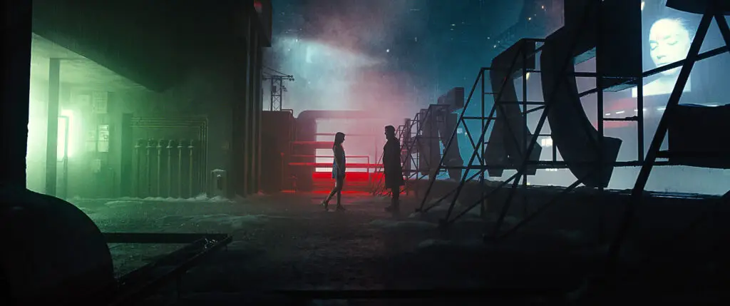
One of the striking things about Deakins’ work is his ability to push colors and use them suggestively to define the background. Amidst the busy urban landscapes and the characteristic smoky haze, he somehow manages to strike the right balance.
Take the frame below. There’s a lot happening here in terms of the use of multiple kinds of light and tones. But, none of this takes the focus away from the tender moment between the two characters in the frame.
Deakin’s Use of Leading Lines
Human eyes are always drawn to symmetry and lines. They’re naturally easy to follow.
Deakins uses this knowledge to his benefit by utilizing a cinematographic technique called Leading Lines. This functions to advance the plot further while making the world in which the film is set in, seem more immersive.
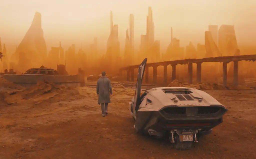
This image makes it seem that the protagonist is walking in the middle of nowhere. With him unaware of where the path may lead to, we’re made aware that he might have hit a deadlock in his investigation. He simply doesn’t know what might transpire next.
In Deakins’ own words,
On ‘Blade Runner’, we used wide lenses quite a lot. We went as wide as 14mm. A lot of the time, we were trying to exaggerate the space we had. Our sets were quite big, but we were trying to make them look even bigger
In this particular shot, Roger frames it to reveal the long path that lies ahead of the character. The path is seen to lead beyond the horizons of the city. This sets up a sense of mystery as the plot starts to unravel, one layer at a time.
Focus on geometric shapes
Roger populates the space with both symmetrical and asymmetrical objects. As an indicator of stability, we see all the objects in a frame lined up perfectly. On the other hand, we see frames where objects are out of place. This is seen to be indicative of a struggle that a character must overcome. The interplay between symmetry and asymmetry is one of the striking elements of the film’s cinematography.
Deakins’ Use of Minimalism
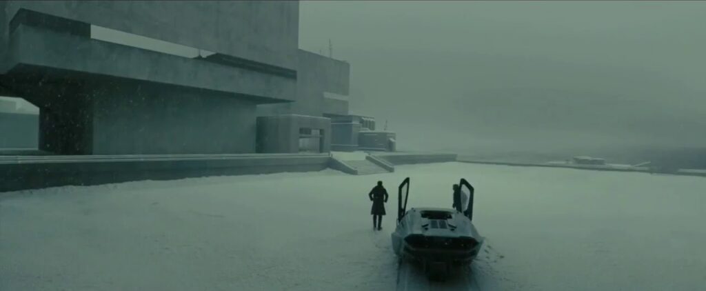
He makes use of silhouettes and minimal compositions in recreating the look and feel of the original. Shooting with wide-angle lenses, he makes use of panoramic landscapes to suggest the city in question was simply incapable of sustaining life. Often characters find themselves in vast desolate expanses lying before them as you can see in the image below.
Talking about the influences behind Blade Runner 2049, Deakins says:
Many of our references were architecture, actually. One of the early references Denis Villeneuve gravitated toward was the architecture in Beijing and the look of the city in the smog; he liked the idea of L.A. being cold, with either rain or snow in exterior scenes. We wanted the environment to be a character in itself, and gradually came to the idea of stark, minimal Brutalist architecture
The idea behind using minimal images was to allow Villeneuve and Deakins to exhibit a largely mysterious world while still ensuring that the audiences weren’t distracted by the eye-popping visuals. The frames might be aesthetically pleasing to the eye, but the objective was to still have the viewers focus on what was happening in the scene.
Colors in Blade Runner 2049 Cinematography
In director Denis Villeneuve’s own words, “I wanted to use color in a narrative way, like I never did before. I was using color for emotions, for impact. But, this time because I had full control, I knew that I will be able to use, like for instance the color yellow as a meaning for me.”
The original Blade Runner took the modern neon of an Asian metropolis and made it a far-off future. Deakins continues this tradition but is pushing the color without losing the dystopian feel — not an easy task. The candy-color nightclub, which appears a few times in the trailer, is just one example.
Colors are absolutely essential in cinematography and nobody knows this better than Roger Deakins. He uses both hot and cold colors in creating the visual palette for Blade Runner 2049. Here’s a brief look at the different colors that Roger and Denis play around with and what they could possibly signify.
Yellow
Deakins and Denis use yellow to signify enlightenment. We see the color yellow within the composition whenever a new plot point is introduced. Notably, Niander, the resident scientist’s lair is basked in shades of yellow. This acts as a subliminal cue to the audience, and more importantly to the protagonist.
Orange
The color orange is generally associated with puzzling mystery and imminent danger. Picking up on these cues, we see that the entire city is bathed in an orange fog when K arrives at Vegas. They help to create a sense of caution. Denis uses these frames to act as the transition between the second and third act. This is the point where K meets Deckard and starts fishing for answers.
Green
Our minds are tuned to think of vibrant life when we think of the color green. Similarly, we get to see the color whenever any one of Wallace’s creations is seen within the frame. Anna Stelline who’s set out to recreate life is positioned around lush forests and lots of greenery. This after all is Blade Runner’s view of “life”.
White
The color white is associated with purity and the absolute truth. So, whenever K comes to finding out his true identity, we see a lot of white in the frame. Towards the end of the film when K chances upon the building which might hold the truth, we again get white, both in the color of the building and the snow outside.
Pink and Purple
These are colors that go along with ideas of extravagance and opulence. They also happen to be closely associated with matters of the heart. So, it’s only fitting that Deakins fills the frame with these colors whenever K encounters a romantic interest, even if they were manufactured by the world around him. We also get to see these colors when K finds his true calling towards the end of the film. Purple also signifies progress and is the major color seen in most of Los Angeles’ futuristic landscapes. These colors are in direct contrast to the ominous orange hues of Vegas.
Gray
The makers use gray to indicate the decaying world of Blade Runner 2049. Gray is used to signify the uninhabitable nature of the city, polluted by the advent of modern technology.
How Deakins used lighting in Blade Runner 2049
Roger Deakins is hailed to be an expert in lighting different scenarios. He takes a much more realistic approach and likes his images to be as natural as possible. In Blade Runner 2049, he strikes the perfect balance between dark tones and luminous neon lights. A variety of lighting techniques had to be made use of to mimic the different environments seen in the film. One of these techniques involved smearing gel over lampshades. The team, reportedly, used more than 14,000 rounds of gel to perfect the look.
One way in which the lighting of the two Blade Runner movies is undeniably similar is the use of moving light sources to suggest an exciting world continuing off camera. But whereas in the original film, the roving searchlights pierce the locations sporadically and intrusively, the dynamic lights of Blade Runner 2049 continually remodel the actors’ faces. One moment a character is in mysterious backlight, the next in sinister side-light, and the next in revealing front-light — inviting the audience to reassess who these characters are at every turn.
The two Blade Runner movies share a lot of similarities in terms of how they choose to light up frames. With Blade Runner, Jordan Cronenweth uses strong shafts of light to achieve the classical noir look that Ridley Scott wanted for his sci-fi epic. He utilizes searchlights that meander around the location to suggest an exciting world that continues to exist off-camera. On the other hand, Roger Deakins makes use of vibrant lights to light up the faces of the characters. As the lights change from warmer front-lights to a forbidding side-light and then to a mystifying back-light, we’re left constantly reevaluating our notions of a character and shifting allegiances.
As Deakins says in an interview with British Cinematographer:
“The sets each came with their challenges. Sometimes we’d be lighting a set with 250 space lights and 32 x 12 light Maxi Brutes, sometimes with 76 ARRI SkyPanels, with 238 x 300W Betweenies, with a bare 24Kw bulb rigged to the bottom of a moving truss, or with just a few 2ft LED tubes supplied by Lightgear in London. We used lines of Colour Blast LED lights or Bad Boy spotlights to create the effect of overhead flying vehicles passing by. One set is lit by a 40’ x 30’ LED screen playing back an image we shot in pre-production, again similar to something we had done in Skyfall. Then there are various settings where the overall cast is red or orange and for these, we needed to gel every light with a specific filter pack.”
In the interview he delved deeper into his lighting methods for Blade Runner 2049 and all the preparation that goes into setting them up:
“For one scene, I had the idea of lights that circle slowly on the ceiling. This involved over 300 Betweenie 300W Fresnel lamps, fitted into two large concentric circles, which then had to be programmed so the light would chase around the circumference. For another situation we made three circular trusses of about 25ft diameter, each of which held 35 10Ks. These lamps were also programmed in a chase so that the effect was of a soft beam of sunlight crossing the set.”
Conclusion
Roger Deakins introduces newer and wildly original ideas to already existing basics to come up with an entirely distinct visual palette for the film. He relies on instincts for framing and composition and doesn’t over complicate it with all sorts of modern gizmos. Thoughtful lighting and purposeful movements further add to the frames. While the frames are aesthetically pleasing, they aren’t designed to take you away from the action in the film. All these artistic additions work to further immerse you into the world of the film.

