There is hardly any other filmmaker working today whose style is as instantly recognizable as Wes Anderson. Ruthlessly symmetric, and always nostalgic, eccentricity may even be the term that first comes to mind. The director, along with Spike Lee and Charles Kaufman, is often touted as one of the forerunners of American Eccentric cinema. A thoroughly visual modern auteur, Anderson’s films hint at a highly creative and character-driven vision for contemporary cinema. Who can forget his impeccably symmetric scenes, or the aesthetically pleasing heist narratives that dominate his films? When it comes to a filmmaker as experimental and as singular as Anderson, breaking down the cinematography of any one of his films comes with many different layers of meaning and purpose. With that said, let’s take a look at his latest film, The French Dispatch, and decode its visual narrative.
Creating motion
Anderson’s chief collaborator in cinematography, DoP Robert Yeoman, has shot seven of Anderson’s films, including The French Dispatch. He’s often remarked that working with Anderson often involves “shooting the impossible”. One only needs to view the quick-moving frames of the film to see this in practice. As Anderson is not fond of using newer technologies or camera rigs to shoot a scene, Yeoman and the rest of the crew relied on building new kinds of rigs themselves, or using scaffolding and ropes to move the cameras up and down. Yeoman notes that the crew punched multiple holes to drop the camera through the floors and ceilings of an old factory in the French town Angouleme, which was used to complete most of the shooting. This he attributes to Anderson’s preference for the old school method of doing things.
The quick shooting and pacing of the footage, usually helped along by a camera dolly instead of a Technocrane, establishes two key tasks. One, it sets the tone for the film’s subject matter. As most of the stories in Anderson’s oeuvre in general, and The French Dispatch in particular, follow a loose, heist-like narrative, this quick sense of movement and dynamism helps immerse the viewer into the film’s atmosphere.
Secondly, Anderson films are known for their immaculately curated sets and backgrounds. Each element has a role to play, and comprises a piece of a large, elaborate visual puzzle. Thus, by having the camera quickly gloss over the surroundings, before halting to a stop on a particular character, it helps familiarise the audience with the fictional microcosm of the film. The quick motion also emphasises the static and rigidly symmetrical composition of most of the frames in the film.
Consider the above scene between Moses (Benicio Del Toro) and Simone (Lea Seydoux). As the camera sweeps through the interiors of the jail and stops, peeking at the pair lying together, one gets a sense of how Anderson and Yeoman arrange the set and actors so that important conversations and moments like this are integrated as seamlessly as possible with the rest of the plot. Even after the footage switches to Simone and Moses conversing about their feelings, the composition of the scene is not static. Rather, it switches perspective, composed of shots that turn the characters upside down as the interaction proceeds. Finally, a final shot that displays the ceiling allows the audience to discover color and light in the black-and-white narrative. With the camera pushing in towards the ceiling, the viewer chances upon Moses’ artistic vision just as he himself does.
Along with Steadicam operator Sanjay Sami, Yeoman and Anderson figure that these new methods of manipulating the camera ultimately yield better results than using cranes or rigs. This is because many of the sequences are complicated and choreographed precisely, with actors reacting to certain camera placements. On top of that, there is also an abundance of whip pans and zooms in Anderson’s films. This means that the actors and crew both need to be able to react quickly and position the camera accordingly, so that the symmetry of the shot is still maintained.
Lighting: Evoking the Past
The French Dispatch is a film that is rife with the pathos of nostalgia. The story itself switches between past and present, evoking memory and literary accounts to display stories of art, revolt and quirk. But it does not just stop at that. As one of the most experimental works from Anderson, the film also employs lighting techniques that evoke the French New Wave Cinema of the fifties and sixties.
Yeoman and Anderson drew from extensive sources including but not limited to French cinema to create the look and texture of The French Dispatch. This involved creating a veritable archive of the works that evoked this certain moment in time, and using them to build a roadmap for the visual tone of the film. Some of these examples include Jean Luc Godard’s work in films like Breathless, Francois Truffaut’s experimental style in The 400 Blows, and Vivre Sa Vie. However, it isn’t just limited to that, as Anderson also used lighting techniques from Golden era Hollywood to provide the black and white scenes in the film a lovely sort of radiance. The idea was to light the characters such that they still have an interesting look despite the absence of color.
Shooting in natural light wherever possible, and maintaining continuity in the way shots are lit at all times went a long way in providing the soft, ethereal light that one associates with Anderson’s projects. Shooting single camera on 35 mm film, with a 200 ASA Kodak allowed Yeoman the opportunity to perfect an organic lighting for each composition. With the use of a few tools like LEDs or Skypanels, warmth and cool tones were adjusted accordingly.
Decoding the significance of the lack of color
Homages to the past are also visible in the stories themselves. While the first part, A Concrete Masterpiece lends a lovely luminosity to the whites of the frames, it does so to evoke the romantic, cool-toned lighting of Old Hollywood. This is an apt stylistic choice for a love story between the figure of the artist, Moses, and his muse, Simone.
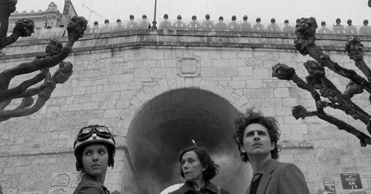
However, the second story, Revisions on A Manifesto, employs the blurry, grainier black and white look associated with French cinema. This is partly due to Anderson’s desire to make an authentic film of the French New Wave tradition, both in form and content. However, the narrative that deals with the death of eccentric student leader Zeffirelli benefits greatly from this hazy treatment. The viewer can almost believe that this soft, out of focus look is almost a visual eulogy given from memory.

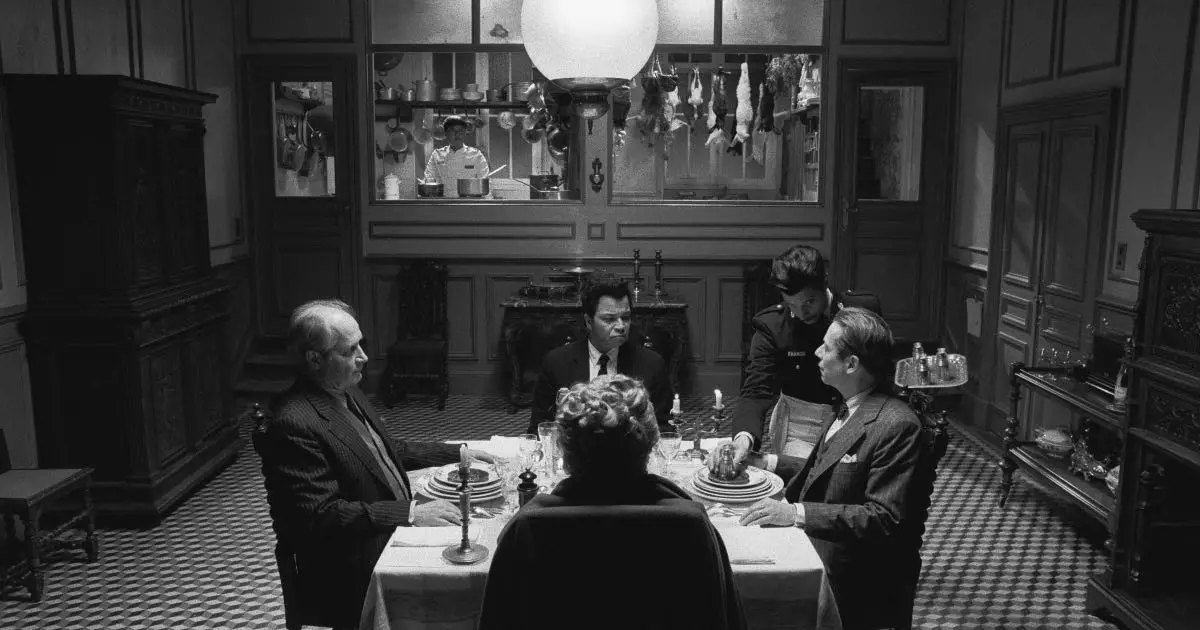
Lastly, The Private Dining Room of the Police Commissioner utilises the low lights and high contrast of noir films, which pairs particularly well with the story of a botched kidnapping. Even with the parodying of the high crime genre, one cannot help but notice that the lighting and blocking in this part of the film function in a way to emphasise mystery and give away as little as possible.
Even though these are minimal changes, the subtle visual clues communicate the differences between the three stories, while drawing upon the conventions of their genres.

Of course, it is rather out of character for an Anderson film to have so little color. However, this is not a continuous turn of events, but an anthology. For a film that mainly happens in the event of nostalgia and memory, having episodic breakdowns, where the past is in shades of black and white and the present is in color helps the audience keep track of what is happening. The bright colors of the present also remind the viewer that the events being presented are told through the idiom of memory and remembrance. To try and assign them factuality would be futile. By creating a frame within a frame mode of storytelling, Anderson references the meta-textuality of the history of film, journalism as well as literature at the turn of the twentieth century.
Conclusion
It would not be an exaggeration to say that The French Dispatch is perhaps one of Wes Anderson’s most experimental films. With a removal of the traditional film structure as well as the interplay between contemporary visual palettes and old aestheticism, the film is put together like an elaborate visual puzzle for the viewer to disassemble and marvel at. Despite its many references, the film creates a whole new look that cannot be attributed to any one cinematic tradition. A true exercise in appreciating the auteurism and eye for detail that goes into making such a film, The French Dispatch is truly paradise for those who admire a layered film with multiple visual motifs.

